
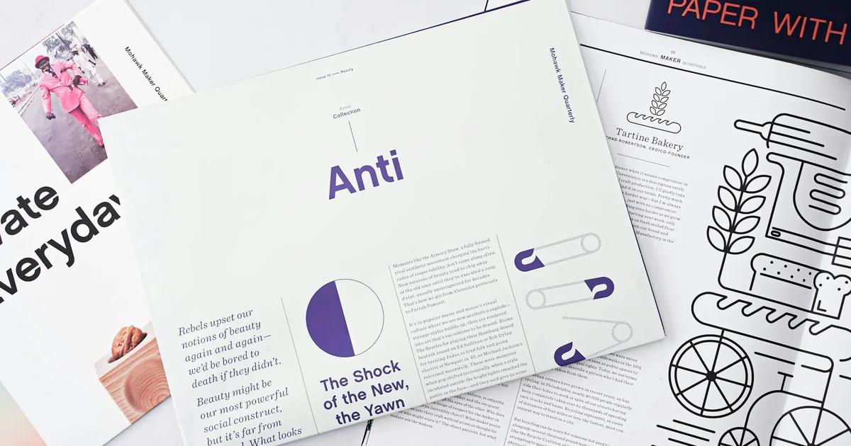
Presentation Slide Content Density Guide
# Presentation Slide Content Density Guide Learn exactly how much text, data, and visuals belong on each slide so your audience follows every point. Apply research-backed rules for word count, bullet limits, and white space. Walk away with a repeatable format that keeps any deck clear from slide one to the last. Words per slide is a starting threshold most readable decks stay under: 75 Bullet points per slide before cognitive load climbs sharply: Max 5 Core principle behind every well-paced, easy-to-follow deck: One idea per slide Every presenter has felt both failure modes. The slide crammed with six bullet points, two sub-bullets each, a chart, and a footnote — the one where the audience stops listening and starts reading. And the slide with a single vague headline floating in empty space, leaving the room wondering what the point was. Neither extreme is a taste problem. Both are density problems. Slide content density is measurable. Researchers define it along two concrete dimensions: word count — the total number of words visible on a slide — and information chunks — the number of distinct content groups an audience perceives as separate from one another. As word count and chunk count increase, so does the cognitive effort required to process the slide. That effort competes directly with the effort of listening to the speaker.

Landing Page Hero Copy Checklist
# Landing Page Hero Copy Checklist Audit every element above the fold — headline, subheadline, proof, and CTA — before your page goes live. Work through each check in order and spot the exact line that's costing you conversions. Fix it once, then reuse the same framework on every page your team ships. Elements to audit: 7 hero checks Covers headline to CTA: Full above-the-fold Reusable for any page: Team-ready framework Every landing page has one block of copy that decides whether the rest of the page gets read. It is not the testimonial section. It is not the pricing table. It is the hero — the above-the-fold cluster of headline, subheadline, visual, proof signal, and CTA that a visitor processes before they have made a single conscious decision about your offer. The stakes are not abstract. A first-time visitor should know what the page is and whether it is for them in under five seconds, and some visitors never scroll past the hero at all, which means the hero must function simultaneously as an introduction and as a complete conversion argument. Miss either job and the traffic you paid for leaves without a signal. Most copy audits fail here because they treat the hero as a design problem — layout, contrast, button color — rather than a copy problem. This checklist treats it differently. Each of the 12 items below is a scored dimension, not a vague suggestion. You assign a pass, a flag, or a fail to each element based on explicit criteria, which means two people auditing the same page will reach the same diagnosis.

Instagram Carousel Safe Zone Spacing Guide
# Instagram Carousel Safe Zone Spacing Guide Keep your text, logos, and CTAs clear of Instagram's UI on every slide. Learn the exact pixel margins and safe area rules for carousel posts. Apply them once and nothing important gets cropped again. Carousel formats covered: Square, portrait & landscape Safe zone edges to know: Top, bottom, left & right Export formats supported: High-res PNG & PDF Every carousel slide you publish arrives on screen already partially occupied. Instagram's interface chrome — the username bar sitting across the top, the like/comment/share row anchored at the bottom, the swipe-indicator dots, and the ad disclosure label on sponsored posts — all render on top of your image. None of it moves out of the way for your headline. None of it checks whether your CTA sits underneath it. The result is predictable: a pull quote clipped by the action-button row, a logo nudged into the corner where the profile icon renders, a spanning panoramic that breaks apart at the swipe edge because the designer measured from the canvas boundary instead of the interface-safe boundary. These are not compression artifacts or upload errors. They are safe zone failures, and they happen before a single viewer swipes. This guide exists to prevent that. It covers the three carousel formats Instagram supports in 2026 — 1080 × 1350 px portrait (4:5), 1080 × 1080 px square (1:1), and 1080 × 566 px landscape (1.91:1) — and gives you the exact pixel margins for each. It maps which interface elements occupy which edges, distinguishes the safe zone from the bleed zone from the swipe continuity strip, and walks through per-element clearance rules for text, CTAs, logos, and faces rather than offering a single blanket margin figure.
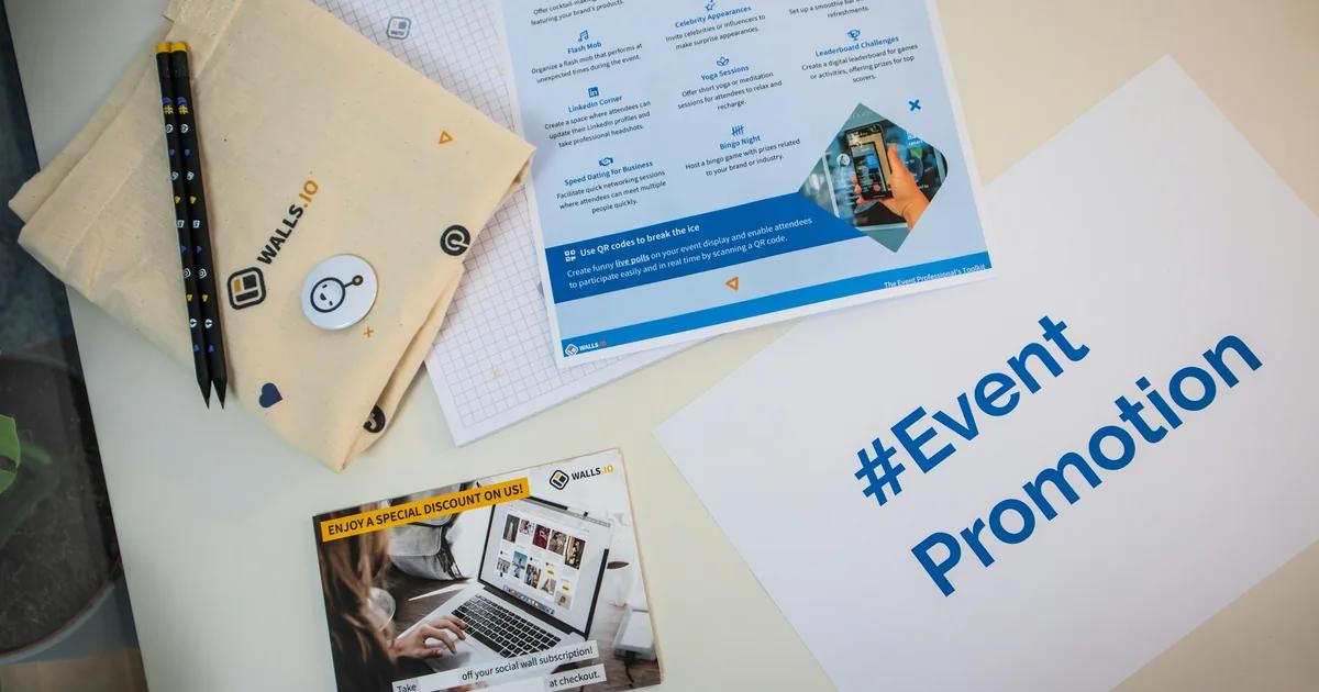
Event Poster Information Hierarchy Guide
# Event Poster Information Hierarchy Guide Learn the right order to present your event details so viewers get the key facts in seconds. Place your headline, date, location, and call to action where eyes naturally land. Export a print-ready PNG or PDF once your layout is locked. Seconds to scan: Most viewers decide to stop or scroll within 3 Clear reading order: Headline → date → location → CTA is the proven Fewer buried details: A strong visual hierarchy keeps critical info Most event posters that fail do not fail because of bad typography or weak color choices. They fail because a person walking past at normal pace — or scrolling a feed at thumb speed — cannot extract the five things they need in under three seconds: what the event is, when it happens, where it is, why they should care, and what to do next. That is a sequencing problem, not a styling problem. You can spend hours perfecting a gradient or hunting for the right display font, but if the date is buried in a decorative band at the bottom and the call to action is set in the same weight as the venue address, the poster is already broken before it reaches a single wall or feed. Research on viewer attention confirms that people decide whether to engage with a visual in under three seconds. That window is not long enough for a viewer to hunt. The information has to arrive in a deliberate order — one that matches how eyes actually move across a surface, not how the organizer thinks about the event internally.

Email Header Dimensions & Mobile Crop Checklist
# Email Header Dimensions & Mobile Crop Checklist Get exact pixel specs, safe zone rules, and a repeatable pre-send checklist for email headers that render cleanly on mobile. Check your dimensions before you send. Export a production-ready header graphic that stays sharp on retina screens. Standard container width: 600–640px Mobile safe text zone: Center 320px Retina-ready export density: 2x resolution You finalize the header. It looks clean at 600px on your monitor — logo centered, tagline readable, CTA visible. You send a test to your phone and the logo is half-gone, the tagline wraps into the button, and the offer deadline is buried below the fold. This is not a rare edge case. It is the default outcome when header art is built to desktop assumptions and shipped without a mobile crop verification step. The core tension is dimensional. A desktop email container sits at 600–640px wide, but the same template on a 320px mobile viewport scales the header image down to roughly half that width. Any text or logo element placed near the horizontal edges of the desktop canvas can disappear entirely on the narrowest common mobile screens. Height compounds the problem: a header taller than 200px pushes body content below the fold on portrait mobile, and some clients apply their own viewport clipping on top of that. Then there are the failure modes that have nothing to do with dimensions at all. Outlook blocks images by default, so a header with no background color fallback and no descriptive alt text renders as a blank white rectangle. Many email clients, including Outlook, block images by default, meaning the header's message must survive without the image entirely. Dark mode in Apple Mail and Gmail can invert or recolor text embedded in images, making white-on-dark headlines suddenly invisible. Retina screens on modern iPhones expect a 2× asset, so a header exported at exactly 600px will look soft unless the source file is 1,200px wide and constrained with a max-width declaration.

Business Card Print Setup and Proof Guide
# Business Card Print Setup and Proof Guide Get your business card file print-ready with the right dimensions, bleed, safe zone, and color settings. Follow each step to avoid clipped text, white edges, or color shifts. Export a clean PDF and hand it off to any printer with confidence. Standard trim size: 3.5 × 2 in Minimum print resolution: 300 DPI Bleed area to add: 0.125 in per side Most business card reprints don't happen because of a bad design. They happen because of a file setup decision made hours or days before the design reached the printer — a canvas built at screen resolution, a background that stops at the trim edge, a font left unembedded, or colors that looked right on a monitor and printed as something else entirely. This guide covers the full setup-to-handoff workflow in a single reference: correct canvas dimensions for US, European, Japanese, and other regional standards; bleed and safe zone rules that prevent white slivers and clipped text; CMYK color mode configuration and what to do before the conversion surprises you; resolution requirements for every raster element in your layout; typography minimums that survive the press; PDF export settings that commercial printers actually accept; and a proofing sequence to catch errors before they become a reprint invoice. The guide is organized in the order you'll work through it. If you're starting a new file, begin at the dimensions section. If your file is already built and you're preparing for handoff, jump to the proofing and export sections. Every specification cited here is drawn from commercial print practice, not screen-design convention — because a business card file and a social media graphic are built to entirely different tolerances, and conflating the two is where most setup errors begin.

How to Build Winning Social Media Content Campaigns
In today's digital landscape, simply posting content is not enough to capture attention. You need a strategy that blends helpful information with striking visuals to truly resonate with your audience. This approach transforms social media from a megaphone into a conversation starter. Understanding this synergy helps small business teams maximize limited resources while building deep trust with their community. Successful brands use psychological triggers like humor or empathy to spark engagement. For instance, a small organic grocer might share stories of local farmers to build a sense of belonging. By focusing on the story rather than the sale, you create emotional connections. Many teams use content-first design tools to turn these stories into professional graphics without spending hours on manual layout or complex software. Start by auditing your current channels to see where your message lands most effectively. Use platform-specific tactics—like detailed infographics for Pinterest or punchy carousels for Instagram—to broaden your reach. Tools like <a href="https://veeso.ai" target="_blank" rel="noopener noreferrer"> Veeso AI </a>helps turn text into polished visuals instantly. This allows you to focus on your core message and high-level strategy rather than getting bogged down in design details.

Why Simple Design Tools Change the Way We Share Stories
Visual communication has moved from a luxury to a necessity for anyone sharing ideas online. When you use research-backed visual strategies, your audience processes information faster and remembers your message longer. Creating these visuals used to require expensive software and hours of training, but the landscape is shifting toward accessibility for every creator. Modern teams now use integrated tools to maintain a consistent professional look without the traditional stress of manual design work. Take the example of large media platforms that have integrated one-click design features directly into their posting screens. By allowing users to generate high-quality headers instantly, these platforms saw a massive spike in user engagement and content quality. This shift proves that when you lower the barrier to entry, creativity flourishes naturally across your entire organization. Using a Veeso AI approach allows marketers to turn raw text into polished slides in seconds, proving that efficiency and beauty can finally coexist. To stay ahead, you should look for tools that prioritize your content rather than forcing you to fiddle with complex layers. Start by auditing your current workflow to see where design bottlenecks happen most frequently in your daily schedule. Embracing automation and intelligent layout tools will free up your time to focus on what matters most: your unique message. You can find more productivity tips for creators to help streamline your digital presence and reach your growth goals faster.

Transform Your Naver Blog Into a Professional Brand Homepage
First impressions happen in a heartbeat, and for many business owners, a Naver blog serves as their digital storefront. A cluttered or generic layout can unintentionally turn away potential clients who value professionalism. By treating your blog design as a branding exercise rather than just a hobby, you establish immediate authority and build a deeper sense of trust with your audience from the very first click. To begin this transformation, you can use accessible design platforms like Canva or explore how modern content-first tools streamline the creative process. For instance, a small marketing agency recently revamped their blog using a 'homepage-style' layout, resulting in a forty percent increase in visitor retention. They focused on high-quality banners and intuitive navigation widgets to guide users through their service offerings effectively while maintaining a cohesive visual identity across all posts. Ready to elevate your digital presence? Start by auditing your current visuals and identifying areas where a professional touch could make a difference. You might explore official Naver Blog design guides or study successful case studies on visual storytelling to sharpen your eye. With the right tools and a clear strategy, anyone can turn a standard blog into a sophisticated hub that truly represents their professional standards and brand values.
FAQ
Our Learn & Blog section covers a wide range of topics including AI design best practices, content creation strategies, marketing tips, design tutorials, case studies, and insights on how to use Veeso AI effectively. We regularly publish articles to help you create better designs and improve your workflow.
We publish new articles regularly to keep you updated with the latest trends, tips, and best practices in AI-powered design. Check back frequently or subscribe to stay informed about new content.
Yes! We welcome suggestions for topics you'd like to see covered. Feel free to reach out to us through our contact page or social media channels with your ideas.
Absolutely! Our tutorials are designed to be accessible to users of all skill levels, from complete beginners to experienced designers. Each tutorial includes step-by-step instructions and clear explanations.
Yes, you're welcome to share our articles! We encourage sharing on social media and with your team. Each article includes social sharing options for your convenience.
Yes! Our articles often include real-world examples, case studies, and practical tips that you can apply immediately to your own design projects. We focus on actionable insights rather than just theory.
You can stay updated by visiting the Learn & Blog section regularly, or follow us on social media where we announce new articles. We also recommend bookmarking the page for easy access.
While our blog focuses primarily on written content and tutorials, we occasionally include video content and links to video resources. Check individual articles for multimedia content.
Yes! The examples and templates shared in our articles are meant to inspire and guide your own projects. Feel free to adapt the concepts and ideas to fit your specific needs.
You can browse articles by scrolling through the Learn & Blog page. Articles are organized chronologically, and you can use the search function (if available) or browse by category tags to find content on specific topics.